matplotlib은 파이썬의 대표적인 시각화 라이브러리입니다. 데이터 과학에서 다루는 텐서는 숫자만으로는 파악하기 어렵지만, 그래프로 그려 보면 분포와 관계에 대한 통찰을 얻기 쉽습니다. 보통 matplotlib.pyplot을 plt라는 별칭으로 가져와 사용합니다.
import numpy as np
import matplotlib as mpl
matplotlibrc 파일 변경 후
캐시 삭제
rm -fv ~/.cache/matplotlib/fontlist*.json주피터의 경우, 커널 재시작
import matplotlib as mpl

print(mpl.matplotlib_fname())  # 설정 파일 경로 확인
print(f"font family: {mpl.rcParams['font.family']}")
print('font.sans-serif:', mpl.rcParams['font.sans-serif'])  # 폰트 리스트 확인
print('axes.unicode_minus:', mpl.rcParams['axes.unicode_minus'])
/tmp/mplcfg/matplotlibrc
font family: ['sans-serif']
font.sans-serif: ['NanumGothic', 'sans-serif']
axes.unicode_minus: False
단일 그래프
import matplotlib.pyplot as plt

# 예제 그래프
plt.title('한글 제목')
plt.xlabel('x축')
plt.ylabel('y축')
plt.plot([1, 2, 3], [-1, -2, -3])
plt.show()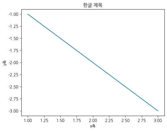
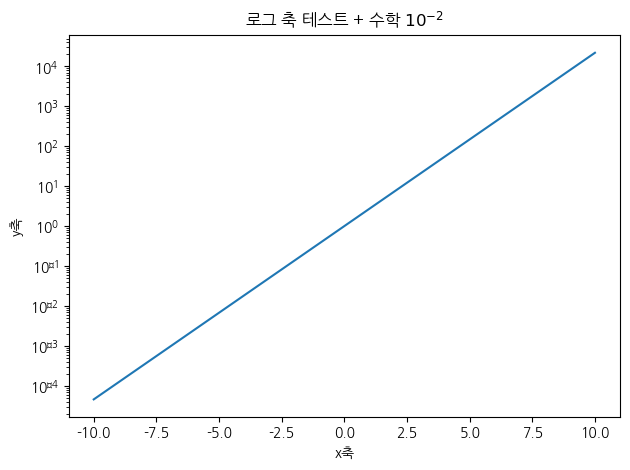
import matplotlib.pyplot as plt
from matplotlib.ticker import FormatStrFormatter

# 로그 축에서 수학 심볼 경고 없이 렌더링되는지 확인
x = np.linspace(-10, 10, 100)
y = np.exp(x)

plt.plot(x, y)
plt.yscale('log')

plt.title('로그 축 테스트 + 수학 $10^{-2}$')
plt.xlabel('x축'); plt.ylabel('y축')
plt.tight_layout()
plt.show()
Font 'default' does not have a glyph for '\u2212' [U+2212], substituting with a dummy symbol.
Font 'default' does not have a glyph for '\u2212' [U+2212], substituting with a dummy symbol.
Font 'default' does not have a glyph for '\u2212' [U+2212], substituting with a dummy symbol.
Font 'default' does not have a glyph for '\u2212' [U+2212], substituting with a dummy symbol.
Font 'default' does not have a glyph for '\u2212' [U+2212], substituting with a dummy symbol.
Font 'default' does not have a glyph for '\u2212' [U+2212], substituting with a dummy symbol.
Font 'default' does not have a glyph for '\u2212' [U+2212], substituting with a dummy symbol.
Font 'default' does not have a glyph for '\u2212' [U+2212], substituting with a dummy symbol.
Font 'default' does not have a glyph for '\u2212' [U+2212], substituting with a dummy symbol.
Font 'default' does not have a glyph for '\u2212' [U+2212], substituting with a dummy symbol.
Font 'default' does not have a glyph for '\u2212' [U+2212], substituting with a dummy symbol.
Font 'default' does not have a glyph for '\u2212' [U+2212], substituting with a dummy symbol.
Font 'default' does not have a glyph for '\u2212' [U+2212], substituting with a dummy symbol.
Font 'default' does not have a glyph for '\u2212' [U+2212], substituting with a dummy symbol.
Font 'default' does not have a glyph for '\u2212' [U+2212], substituting with a dummy symbol.
Font 'default' does not have a glyph for '\u2212' [U+2212], substituting with a dummy symbol.
1스타일
그래프의 선 모양·색·마커를 지정해 표현을 조절할 수 있습니다. linestyle, color, marker 같은 인자를 따로 주거나, 'ro--'처럼 색·마커·선종류를 한 문자열로 묶어 간단히 지정할 수도 있습니다.
plt.plot(np.arange(10), linestyle='--', color='red', marker='o')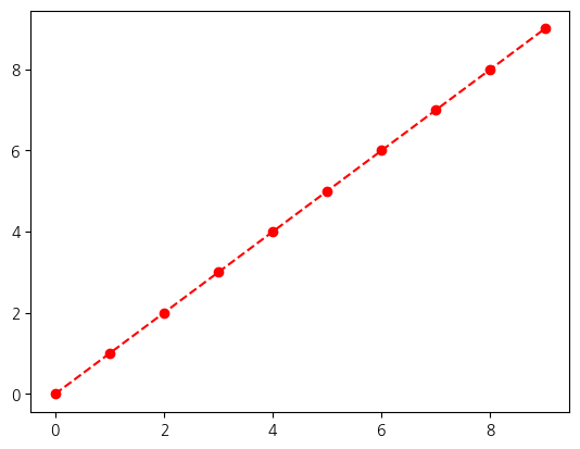
plt.plot(np.arange(10), 'ro--')plt.plot(np.arange(10))
plt.plot(np.arange(10)[::-1])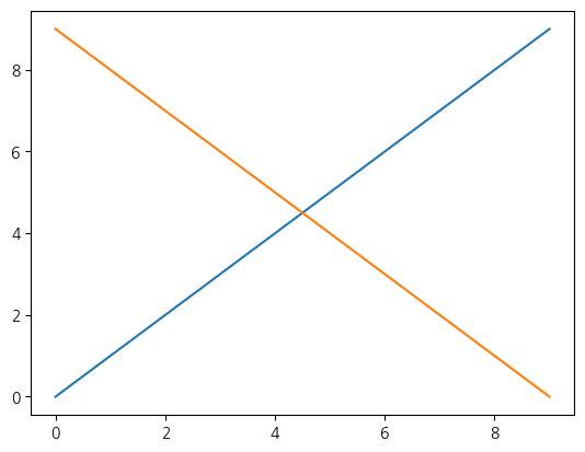
subplots = plt.plot(np.random.randn(1000).cumsum())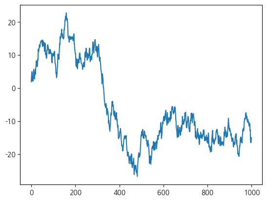
2Subplots
matplotlib의 그래프는 그림틀(Figure) 과 그 안의 그래프 영역(Axes) 으로 이루어집니다. plt.figure()로 그림틀을 만들고 add_subplot으로 영역을 추가하거나, plt.subplots(행, 열)로 여러 영역을 격자로 한 번에 만듭니다. 각 영역에 대해 plot·hist 등을 호출해 서로 다른 그래프를 나란히 배치할 수 있습니다.
fig = plt.figure()<Figure size 640x480 with 0 Axes>subplot = fig.add_subplot(1, 1, 1)fig
fig = plt.figure()

ax1 = fig.add_subplot(2, 2, 1)
ax2 = fig.add_subplot(2, 2, 2)
ax3 = fig.add_subplot(2, 2, 3)
ax1.hist(np.random.randn(100), bins=20)
ax2.scatter(np.arange(30), np.arange(30) + 3 * np.random.randn(30))
ax3.plot(np.random.randn(50).cumsum())

fig.set_size_inches(8, 6)
fig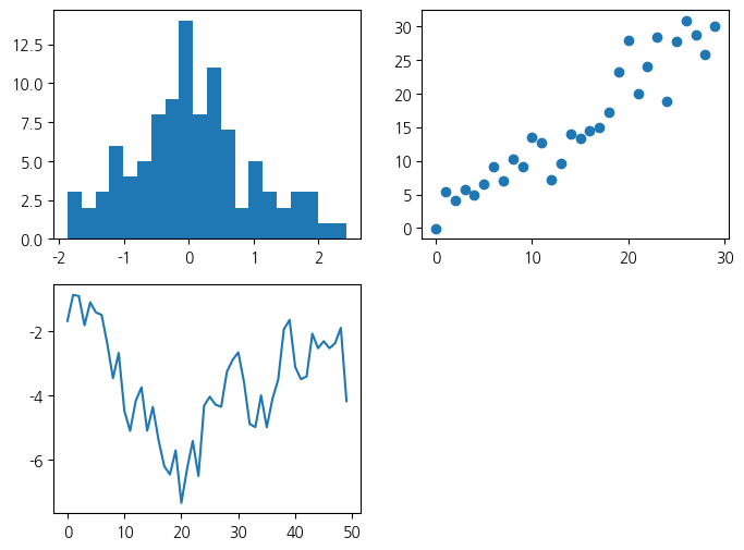
fig, axes = plt.subplots(2, 2, figsize=(8, 6))
axes[1, 0].plot(np.random.randn(50).cumsum())fig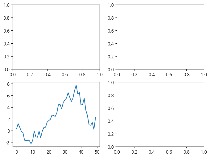
3눈금, 라벨, 범례
그래프를 읽기 쉽게 하려면 축의 눈금과 이름, 제목을 설정합니다. set_xticks·set_xticklabels로 눈금과 눈금 이름을, set_xlabel·set_ylabel로 축 이름을, set_title로 제목을 지정합니다.
fig = plt.figure()
ax = fig.add_subplot(1,1,1)
ax.plot(np.random.randn(1000).cumsum())
ax.set_xticks([0, 250, 500, 750, 1000])
fig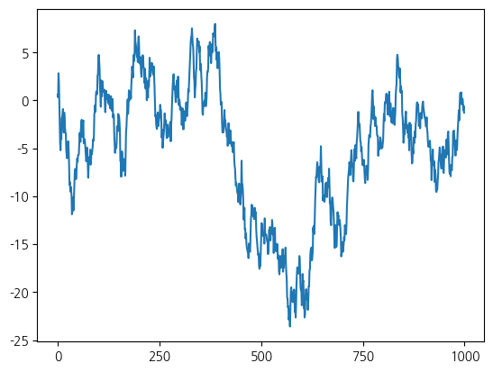
ax.set_xticklabels(['one', 'two', 'three', 'four', 'five'])
fig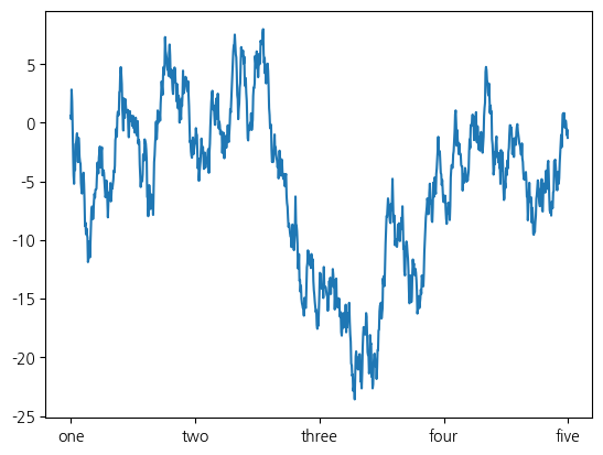
ax.set_title('some data')
fig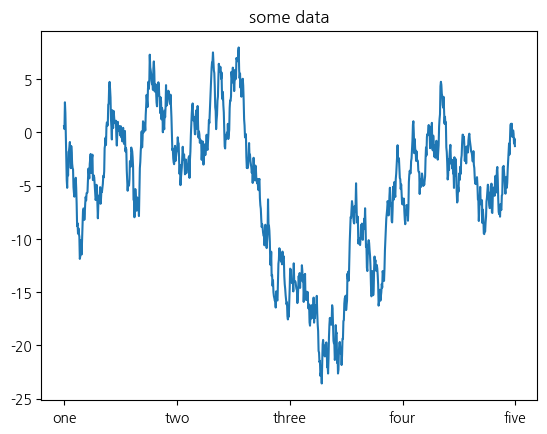
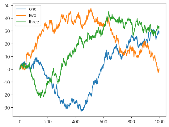
3.1범례 추가
여러 선을 한 그래프에 그릴 때는 각 선이 무엇을 뜻하는지 범례(legend) 로 표시합니다. plot에 label을 주고 legend()를 호출하면, 각 선의 이름이 범례로 나타납니다.
get_randn = lambda n: np.random.randn(n).cumsum()

fig = plt.figure()
ax = plt.subplot(1, 1, 1)

ax.plot(get_randn(1000), label='one')
ax.plot(get_randn(1000), label='two')
ax.plot(get_randn(1000), label='three')
#"적당한" 위치에 범례 추가
ax.legend(loc='best')
plt.show()